Distinctive, not decorative
The AP geometry and wide wordmark provide recognition. Keep supporting graphics quieter than the identity.
 BRAND IDENTITY GUIDELINES
A distinctive signature. A clear information system.
The original AltraPure identity, evolved through clinical blue and a disciplined approach to typography, composition and product information.
Edition 05 · Logos, FA02 pattern, fonts, pen sources and offline guide.

Build recognition through the original AP device and wordmark. Build clarity through an orderly information hierarchy. The result should feel precise and assured, without becoming cold, decorative or visually clinical for its own sake.
Give designers one coherent system for AltraPure’s digital communications, technical documents and pen-label applications. Retain the established logo family; replace its indigo with clinical blue. Carry the character of the pen typography into the wider identity without changing the logo lettering.
At a glance, the reader should recognise the brand, identify the subject and locate the information they need. Use strong hierarchy and well-placed space, not a larger logo or more decoration, to make a layout feel complete.
The AP geometry and wide wordmark provide recognition. Keep supporting graphics quieter than the identity.
Separate product identity, quantities and traceability. Group related information and give it a consistent reading order.
Use direct language, accurate product imagery and factual captions. Visual polish must not imply a certification or performance claim.
This guide establishes working design standards. Existing released pen artwork remains the production reference; new layouts shown here are applications of the identity, not replacement print masters.
Six original configurations, three colour artworks. Choose the configuration for the available space and the colour for its background. These are practical adaptations of the same identity, not competing logos.

The default for brand-led communications. Use the horizontal detailed signature where its fine stripes remain distinct.

For blue cover panels, brand fields and high-impact placements. The background belongs to the layout, not the transparent logo file.

For one-colour reproduction, restrained documents and applications where colour is unavailable. Use the original black export.
For dark neutral fields and monochrome applications. It uses exactly the same white artwork as the blue-background version.
The original designer’s specification identifies customised Acumin Variable Wide Black lettering, modified to match the AP device. Use the supplied outlines. Neither retyping Acumin nor substituting Bricolage will reproduce the logo.
Horizontal: default signature for headers and landscape spaces.
Stacked: portrait or square compositions.
AP symbol: a secondary identifier when the brand name is already present or clearly established.
Detailed: larger placements where the striped device is crisp.
Simple: small, low-resolution or challenging reproduction. Do not make a simplified version by deleting paths yourself.
Let H be the visible height of the AP symbol. Keep at least H/4 free around every edge of the complete lockup. Apply the same rule to horizontal, stacked and icon versions.
Measure from the visible artwork, not the file boundary. Original artboards are preserved; their existing blank space may not satisfy this new layout standard on every side.

Use these working minima across the complete original SVG artboard width. Digital samples below are shown at their stated CSS width on wide screens. Print values are conservative starting points, not printer-qualified limits: proof at final size and move to the simple mark if fine detail closes up.


Scale proportionally. The AP device is not square.
Application fonts are not substitutes for the custom wordmark.
Use the appropriate solid artwork, not a low-opacity corporate logo.
Use blue as the recognition colour: the signature, a deliberate brand field or a small number of meaningful accents. Let white and neutral text carry the reading. A blue field is legitimate brand expression, not something limited to a tiny accent.
#1E7FE0
sRGB 30 / 127 / 224
Primary logo and brand colour.
#231F20
The digital black artwork is retained as supplied.
#FFFFFF
Paper, negative space and reversed artwork.
Body text may use pure black #000000; neutral greys may support rules and secondary information. They are functional neutrals, not additional brand colours. Do not use colour alone to distinguish product strength, status or an instruction.
Ratios calculated from sRGB values using WCAG luminance. Logos have a specific WCAG text-contrast exception; ordinary text does not. The original logo black is not pure black and gives only 4.01:1 on clinical blue.
The original PMS 2746 C and CMYK 100 / 98 / 0 / 0 specify the retired indigo. Do not reuse them for clinical blue. A new process build or spot match must be selected for the printer, stock and finish, then approved from a physical proof. The current Epson pen file already has its own controlled sRGB workflow.
Our signature plus-and-diagonal motif is part of the AltraPure identity. Keep its original geometry, now in clinical blue.

Use FA02 on covers, dividers and supporting brand surfaces. It adds recognition without replacing the logo.
Use the full-colour pattern as a feature, or at 10% opacity as a quiet background. Keep dense copy, dose information and QR codes on a solid field.
Scale proportionally and crop where needed. Do not redraw the motif, stretch it, change its angle or replace it with generic stripes.
Included in the complete brand kit. PDF and EPS are RGB references; approve the output profile, substrate and proof before print production. Original indigo CMYK/PMS separations remain historical sources.
The wide custom logo supplies the signature. Bricolage supplies product character, Manrope supplies reading comfort, and the condensed and monospaced faces solve specific information problems. Most communications need only Bricolage and Manrope.
Use 600–700 for general headlines and 800 for the existing S09 product name. Short, sentence-case headings. Do not make the whole page heavy, and never use this face to rebuild the logo.
Use 400–500 for running text and 600–700 for labels or emphasis. Set readable line lengths, left-aligned paragraphs and consistent units. Preserve the released label’s specific weights.
Use when genuine physical constraints require compact copy. Keep it out of long-form body text. The current S09 information style uses weight 550.
Use 400–500 for identifiers, codes and technical references. Preserve exact characters; do not letter-space a code to make it look decorative.
| Style | Digital starting point | Purpose |
|---|---|---|
| Display | Bricolage 600–700 40–64 px / 1.05–1.15 | One clear main statement |
| Section title | Bricolage 600–700 28–36 px / 1.15 | Navigation through content |
| Body | Manrope 400–500 16–18 px / 1.5–1.65 | Reading, not decoration |
| Supporting detail | Manrope or JetBrains Mono 12–14 px / 1.45–1.6 | Captions or identifiers |
These are communication-layout defaults, not replacement label dimensions. At narrow widths, reduce display size before reducing body size. The print label keeps its released source sizes. Four font families and their licenses are included; the customised logo needs no live font installation.
Build layouts around a shared left edge and a clear reading sequence: identity, subject, supporting information. Use white space to separate ideas. Use blue to establish a focal point, not to outline every component.
A clear title, a short introduction and an orderly place for specifications. The brand signature identifies the page without competing with its subject.
A concentrated brand field for a cover or opening panel. Use pure black for supporting copy at normal reading sizes.
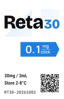
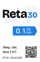
The S09 pen label is the worked application: product identity leads, quantity is easy to find, and compact technical information remains organised. Its distinctive typography informs the wider brand; it does not replace the corporate logo.
Compare all four sides, or select a side for a larger view.
S09 placement references. The flat artwork governs the label.
35 × 54 mm, R1.5 mm corners.
35 mm runs axially; 54 mm wraps around the pen.
The logo colour update does not authorise moving the QR, inserting a new signature or changing dosage copy. Preserve the v7 Epson release, coordinates and artwork until a new label revision is explicitly issued.
Print the printer PDF at 100% using the supplied Epson settings and specified stock. The dimensioned drawing is not a print master. Check actual-size fit, colour, QR readability and batch copy before production.

All six original configurations are available in clinical blue, black and white. Every preview downloads its SVG. White is shown on both backgrounds for clarity; both links deliver the same transparent white file.
Primary signature. Headers, covers and larger brand placements.
Compact signature. Narrow headers and small document branding.
Portrait or square compositions with room for the striped detail.
Compact portrait placements. Keep the original line breaks.
Secondary brand device when the AltraPure name is already established.
Small identifiers and avatars. Fit the non-square symbol; do not stretch it.
Original SVG artboards and lettering are preserved. Preview frames provide display padding; they do not crop or alter the downloaded files. Original black and white exports are retained unchanged. New blue EPS and PDF exports are RGB references, not approved CMYK or spot separations.
The kit retains the original format families instead of reducing everything to web assets. Choose the file by its use, not by whichever thumbnail opens first.
| Format | Use | What is supplied |
|---|---|---|
| SVG | Digital, scalable layouts, vector editing | Six layouts × blue, black and white. Original artboards and paths. |
| PNG | Slides, documents, transparent placement | Same three colours, at the original raster dimensions. |
| JPEG | Flat previews on white | Original blue/black coverage. No transparent JPEG. |
| EPS | Vendor vector workflows | Original black/white EPS; clinical-blue RGB vector reference. See production note below. |
| TIFF | Legacy raster print workflows | Original black TIFF files, unchanged. |
| Convenient vector placement and review | Additional blue, black and white exports. Not a PDF/X claim. |
The original pack contained separate indigo CMYK and PMS exports. They cannot become clinical blue by renaming them. Those legacy files remain in the source archive; current RGB EPS references are supplied instead. Issue final clinical-blue CMYK or spot files only after the output profile, substrate and proof are agreed.
Logo files, the FA02 brand pattern, application fonts and licenses, colour tokens, the readable offline guide, and the unchanged pen source, references, dimensions and printer PDF.
Original dispatch, legacy colour separations and historical packaging references stay separate from current working files. The current FA02 pattern is included in the complete kit.
Check the original logo is intact, the background suits its colour, clear space survives trimming, and text is readable at the intended size. Verify fonts and linked assets, then proof production artwork on the actual output. A visually correct presentation is not itself a production approval.
Identity continuity comes from the original AltraPure dispatch and its designer’s specification. Application recommendations follow established brand-guideline practice: explain the purpose of variants, demonstrate them in context, separate logo artwork from working typography, and account for reproduction.
These sources inform the approach; they do not endorse AltraPure. Spacing, scale and composition recommendations are specific working standards for this guide, not requirements copied from another brand.